
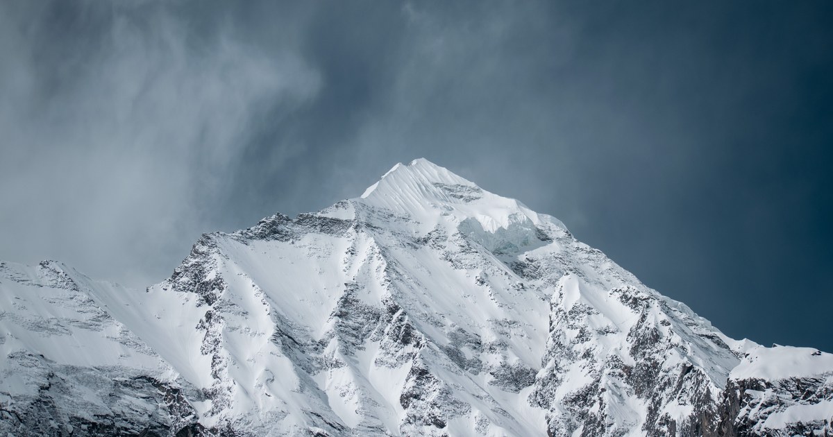
Search for the deadliest mountain in the world and you will get a confident answer with a confident percentage attached. Annapurna I, around 32 percent. K2, around 25 percent. Those figures appear in article after article, usually with no date on them, which is the problem. They are real numbers from a real dataset, but they describe a period that has largely passed, and the statistic they come from measures something narrower than most readers assume.
Annapurna I is usually called the deadliest mountain in the world, but the ranking rests on a death-to-summit ratio: total fatalities divided by total successful ascents. It is not the chance that a given climber dies. As successful ascents pile up, the same mountain’s published rate falls without its hazards changing at all.
What the deadliest mountain in the world number actually counts
Three things go into the ratio, and each one is looser than it sounds.
The numerator is deaths on the mountain, not deaths among summiters. The Himalayan Database, the reference compilation for Nepal, counts fatalities above base camp. That includes people who died on the approach to a high camp, during route preparation, or on descent from a failed attempt. Alan Arnette’s annual Everest tally makes the composition explicit: of the deaths recorded on Everest through December 2025, roughly 61 percent were expedition members and roughly 39 percent were hired workers, many of them Sherpas working low on the mountain while fixing the route. A large share of the numerator, in other words, describes labor rather than clients.
The denominator is ascents, not people. One climber who summits three times adds three to the bottom of the fraction. A guide with a dozen ascents adds a dozen. So the ratio systematically understates individual risk on heavily guided peaks, where a small number of professionals rack up repeat summits.
Nobody is counting attempts. The number you would actually want, deaths per person who set out, is much harder to assemble, because expedition rosters are incomplete and independent attempts go unrecorded. When a source does publish a per-member rate, it lands well below the per-summit rate. Arnette’s Everest page reports a headline rate near one death per hundred summits, while simply dividing his raw career totals, 339 deaths against 13,737 summits through December 2025, gives roughly 2.5 per hundred. Both numbers appear in the same article. They differ because they are not the same measurement, and that gap is the entire lesson.
Annapurna’s 32 percent belongs to a specific era
The famous figure has a date on it, even when the articles quoting it do not.
In 2013, NASA’s Earth Observatory described Annapurna as the deadliest eight-thousander with a fatality rate of 32 percent, noting that the mountain had recorded only 191 successful summits by 2012, the fewest of any eight-thousander. That is the number the listicles inherited. It was accurate for a mountain that almost nobody had climbed successfully.
Then the denominator grew. By January 2022 the count stood at 365 ascents of Annapurna I Main against 72 climbing fatalities, a rate just under 20 percent. By 7 February 2025, Guinness World Records, citing Himalayan Database figures, put Annapurna I at 75 deaths against 559 ascents, a ratio of 13.42 percent.
Read those three snapshots in sequence and the mechanism is obvious. Between early 2022 and early 2025 the mountain added roughly 194 successful ascents and three recorded deaths. The rate did not fall because Annapurna became gentler. It fell because far more people started getting to the top, on fixed ropes, with supplemental oxygen and modern forecasting, and the fraction has a much bigger bottom than it used to.
That is the honest way to phrase any of these numbers: the ratio through 2012 was about 32 percent, the ratio through early 2025 is about 13 percent, and the mountain is the same mountain.
K2’s number moved the same way, only faster
K2 has always carried a reputation to match its nickname, which has a history of its own in why K2 is called the Savage Mountain. Prior to 2021, roughly one person died on K2 for every four who reached the summit, which is where the quoted 25 percent comes from.
Then commercial guiding arrived. On 22 July 2022, 145 climbers summited K2 in a single day, a queue that ExplorersWeb compared directly to Everest at its most crowded, on a mountain that had long been considered too technical to commercialize. Fixed ropes, bottled oxygen and large hired support teams had made the difference.
The published ratio responded immediately. As of August 2023, an estimated 800 people had reached the summit of K2 and 96 had died on it, which works out to about one death per eight summits, or roughly 12 percent. Different compilations produce slightly different figures depending on which deaths and which ascents they include, so treat any single decimal with suspicion. The direction of travel, though, is not in doubt: K2’s death-to-summit ratio has fallen from roughly a quarter to something close to Annapurna’s current figure, and it did so in about three seasons.
Equal ratios, different mountains
Here is why two peaks landing near 13 percent tells you very little on its own. The ratio compresses completely different hazard signatures into one number.
On Annapurna, the danger is dominated by avalanche and collapsing snow and ice on enormous, steep, loaded faces. NASA’s description of the mountain flags the avalanche-prone north face that the 1950 French first ascent switched to, and the south side is a wall of rock rising some 3,000 metres (9,800 ft), among the hardest climbs anywhere. Hazard on Annapurna is spread across long stretches of terrain and is largely a matter of what the slope above does while you are beneath it.
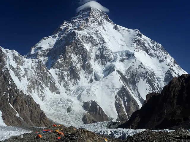
On K2, a disproportionate share of the deaths cluster in one place. The Bottleneck is a steep couloir overhung by seracs from the ice field below the summit, and it sits directly on the standard route. In the 2008 disaster, eleven climbers died over 1 and 2 August after serac falls severed the fixed lines high on the mountain, the worst single accident in K2’s history. Hazard on K2 is concentrated, geographic, and unavoidable on that line.
Same statistic, opposite structure. One is a mountain-wide exposure problem, the other is a specific overhanging feature. Nothing in a percentage tells you which you are looking at, which is why the ratio is a poor tool for comparing mountains and a good tool only for describing a mountain’s own history.
What the ratio cannot rank at all
Plenty of lethal mountains never appear in these rankings, because the arithmetic needs a denominator nobody keeps.
The Matterhorn is the clearest case. It is estimated that over 500 alpinists have died on it since the first ascent in 1865, a toll that began with the 1865 disaster itself, and it is one of the highest absolute death counts of any peak on Earth. But there is no register of successful Matterhorn ascents comparable to an eight-thousander summit list, so it cannot be given a ratio, and so it drops off lists built around one.
Coverage gaps cut the other way too. The Himalayan Database compiles expeditions in the Nepal Himalaya, which is why Nepal’s peaks have such clean long-run statistics and why K2, sitting on the China-Pakistan border, has to be tallied from other sources. Comparing a Nepali eight-thousander with a Karakoram one means comparing two different bookkeeping traditions.
Then there is scale. Kilimanjaro, the free-standing giant of the African plains, receives vastly more visitors each year than every eight-thousander combined, so any ratio built on its numbers is dominated by the denominator and lands near zero, no matter what happens on the mountain. And curated lists like the Seven Summits are assembled by continent, not by risk, so they mix a walk-up with a genuinely serious climb and imply an equivalence that does not exist.
None of this is guidance about climbing anything. Route, conditions and timing decisions belong with current maps, guidebooks, local authorities and professional guides, not with a statistic. What the ratio is genuinely good for is reading a mountain’s history: how often people have succeeded on it, over what period, and how that has changed.
The peak in front of you
Most of us meet these mountains from a viewpoint, a plane window or a photo, not a base camp. That is the more interesting question anyway: not how many people a summit has killed, but which summit you are looking at. Point your camera at the skyline and Mountain Identifier names the peak and gives you its elevation, prominence and range, so the mountain stops being an anonymous silhouette and starts being a specific place with a specific record behind it. The numbers get a lot more meaningful once you know whose they are.
The real peaks
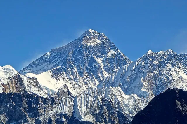
Genuine photographs of the summits above — so you know what to actually look for:
Sources
- Deadliest Himalayan mountain (Guinness World Records)
- The Himalayan Database
- Annapurna: Deadly Mountain (NASA Earth Observatory)
- Everest by the Numbers: 2026 Edition (Alan Arnette)
- K2 Is Beginning to Look a Lot Like Everest (ExplorersWeb)
- K2 (Wikipedia)
- Annapurna Massif (Wikipedia)
- 2008 K2 disaster (Wikipedia)
- Matterhorn (Wikipedia)